
What would your favorite movie poster look like in another country? Or a book cover?
The cultural characteristics of different countries can be different, so you will never find two identical advertising posters for the same product. Today we will take a look at why advertising posters have to adapt to different audiences and markets and examine some examples.
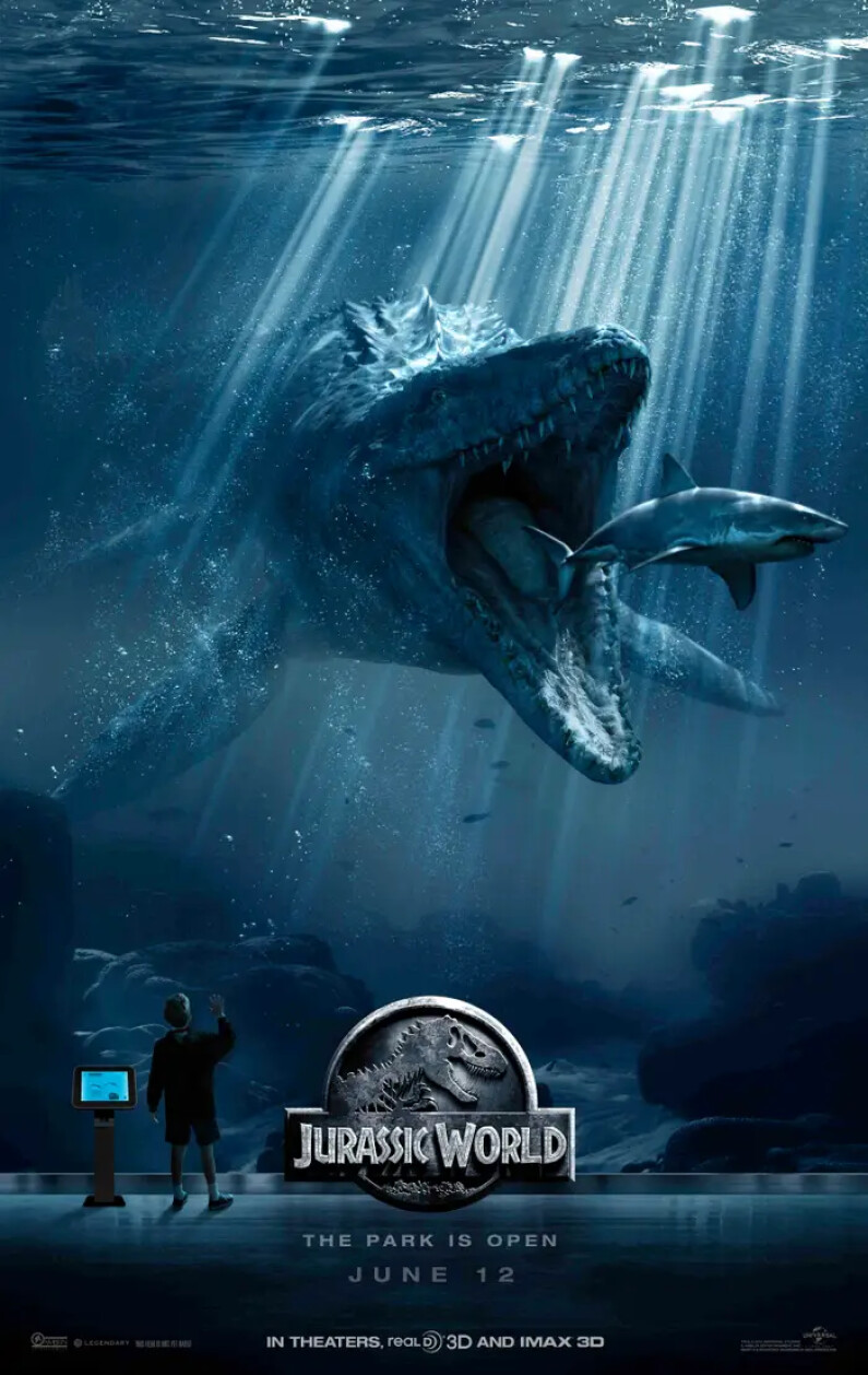
Jurassic Park
American poster:
Chinese poster:
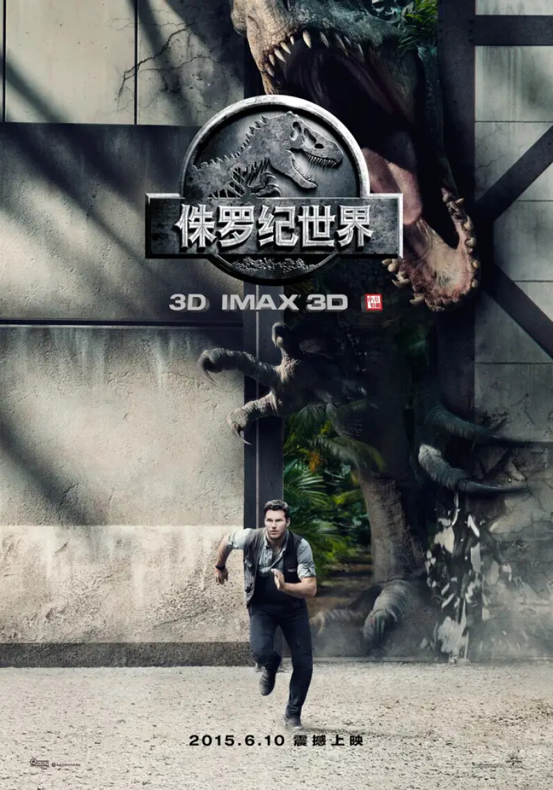
Traditionally, Western cinema in Asia is depicted in typical Asian panache, allowing the Chinese viewer to associate a picture with the reality they live in. Artists hired by Western distributors (or film companies) can create up to five hand-drawn images, which might not demonstrate the "products image." However, it fits perfectly into the local tradition. Here, the filmmakers and distributors took a risk. However, it worked: the famous actor in the film (Chris Pratt) is characterized by his face, so the emphasis is on him, not the dinosaur leaping out from behind the park's walls. The focus on a face is typical in Asia.
Ant-Man
American poster:

Russian poster:

The poster for the American audience was designed primarily for a viewer already familiar with the world of superheroes. In contrast, the Russian version aimed at the audience seems to match some of the traditions associated with James Bond films: The circle in the background of the image functions as an innovative feature, and the colors, except for those that characterize the main character, are darker. This choice of poster design is likely due to the lack of interest in superhero movies in Russia, which in America have always been popular and still are. Therefore, the average Russian viewer is shown who Ant-Man is and what exciting things might happen in the film. So, regional specifics determine the recognition for a brand that marketers adapt to each country (whether it is an advertisement for a hand cream or a car).
Star Wars: Stories. Rogue One
American poster:

Russian poster:
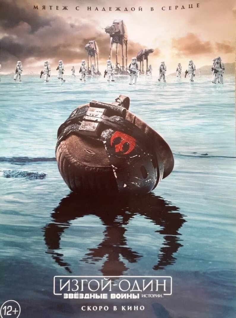
The posters are remarkably similar: they are created using the same technique and the color scheme. Although in America, the poster clearly reveals what the film will be about and represents all the film's main characters, in Russia, the poster creators leave you intrigued, keeping their cards close to their chest. The only way to predict what the film will be about from the promotional poster is through the words "Rebellion with Hope in the Heart," the Rebel Alliance logo reflected in the water, and the clones running in the background.
Apparently, the film audience in Russia (according to the poster's creators) is far more aware of the Star Wars universe than its American fans. In addition, using the film's characters as a promo is not especially relevant in Russia. There has never been a problem with the enslaved African American population here, and black knights do not fit into the similar problem of serfdom. Hence, their use on the poster is irrelevant here.
Doctor Strange
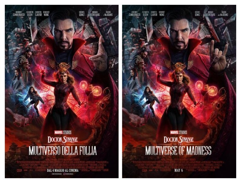
The difference between cultures is clearly demonstrated here. In the Italian poster (left), the doctor shows an entirely different hand signal than in the American image. The point is that in Italian culture, the "goat" hand signal the doctor displays mean that the wife of the person to whom the sign is directed is cheating on them. This is an absolute insult, which could cause a significant offense. Filmmakers are doing the same in other markets: variations in signs shown by the character on a poster can be fatal. Even if a person has moved to another country and embraced a new society, they will continue to perceive signs differently than is customary in the culture where they now live, so extreme care must be taken when creating a poster. In the case of countries with large migration, this presents a different problem.
Star Wars Episode 4 A New Hope
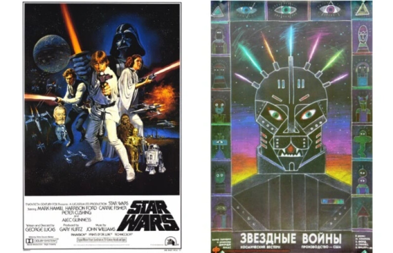
As you can see from the images, the American audience for the first film of the Star Wars saga knows much more about the characters than the Russian viewers. This is understandable: Western art started appearing in Russia back then, and local audiences had minimal ideas about Western cinematic worlds. The difference, of course, is significant: instead of Princess Leia and Han Solo, the poster shows a robot that looks remotely like R2-D2 with funny detectors. Perhaps this is one of the most striking examples highlighting cultural differences between audience segments. The Russian poster was largely determined by quirks of content consumption by viewers at that time, as well as the style of creating Soviet-style posters, where lettering played a considerable part.
King Kong
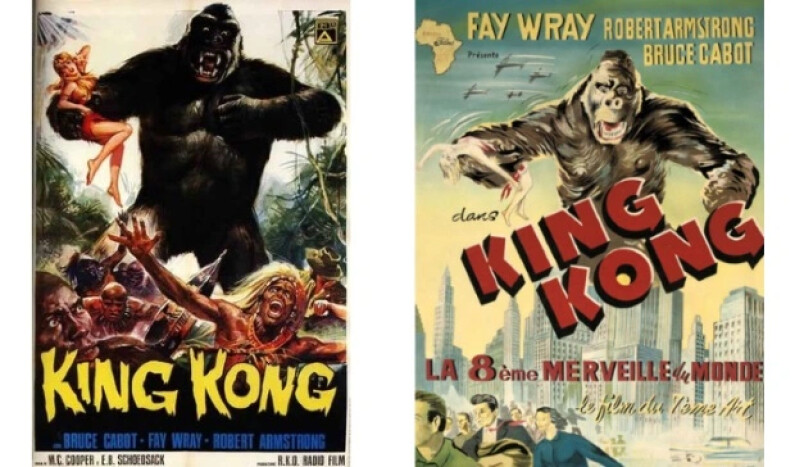
The first poster reveals the now-familiar American version. The second poster was used to promote the film in the Belgian Congo. Cultural differences are again evident: heroes who were not white were removed from the image, and a girl is missing from King Kong's hand. This stems from the strict customs of the Belgian colony and the establishment of Western traditions in a rather large African country. In addition, a modern city appears in the image's background instead of the jungle. According to the poster designers, the story about a giant ape in a metropolis would captivate the audience of the Belgian Congo more than a story about an ape in the rainforests.
Ghostbusters
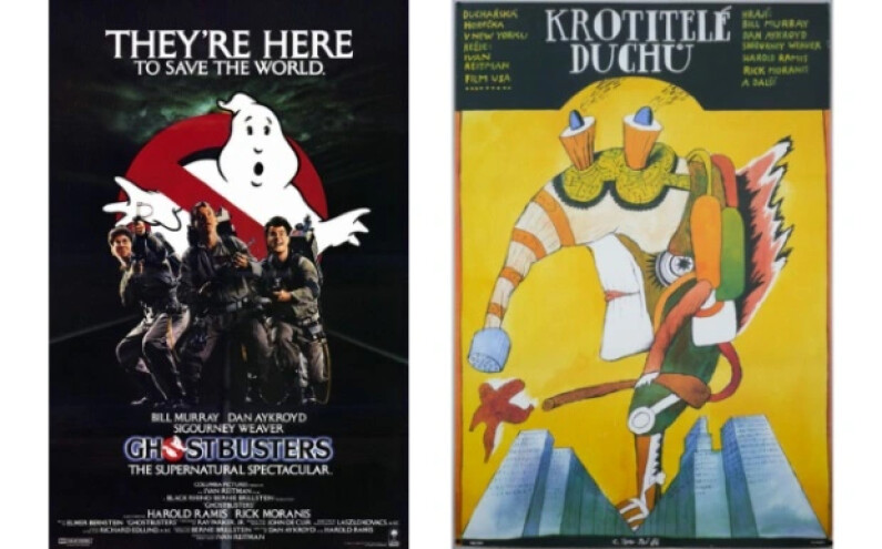
The right-hand-illustrated poster stands for the fantasy part of the film "Ghostbusters" advertising campaign in former Czechoslovakia (which, incidentally, is the home country of the director of the film.) The Ghostbuster here resembles a steampunk plague-style doctor rather than a real person, which was also remarkably similar to Polish posters in those days - we will talk about that later. We can deduce that the audience of former Czechoslovakia perceives the advertising poster with the same cultural codes and layers as the audience from Poland. Mostly, these images resemble the perception of a "man of the eighties": a traditional consumer who used to paint posters and the certain style that began with the revolutionary posters of the 1920s.
Sex In The City
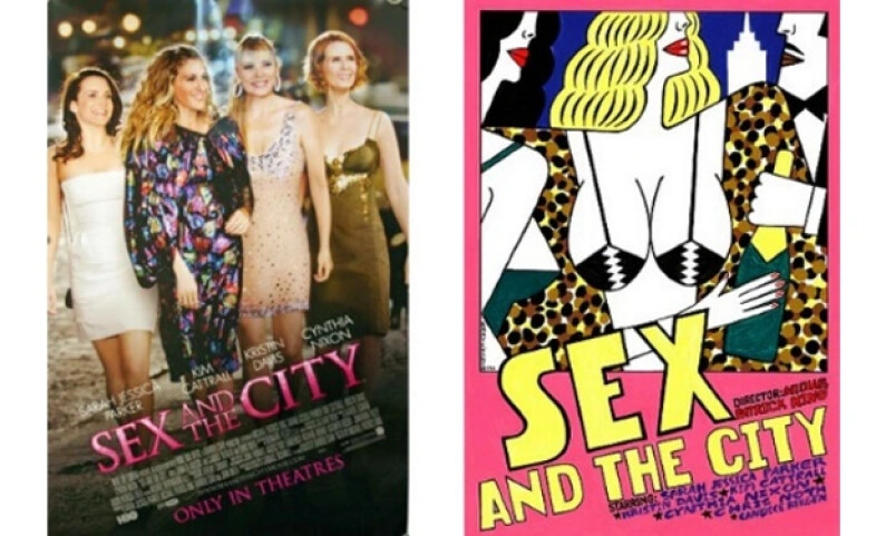
Again, we have a hand-drawn poster, this time released as a limited edition. The image on the right is by Polish designer Andrey Kraevsky, created mainly for Polish audiences. Poland has always been different from other countries in adapting advertising materials for Western projects: the number of hand-drawn posters per film exceeds all possible figures. Although, of course, more often than not, posters of this kind are complemented by more traditional versions (just in case!)
Why are such unusual posters popular in Poland? It is simple: during Soviet times, the country had a most powerful poster school. Not so much for advertising but for propaganda: the school existed from the 1940s to the 1980s, and its self-proclaimed students created political illustrations. You could find some of them in the "Windows of ROSTA" - satirical posters that Soviet artists painted at the beginning of the 20th century. Even Mayakovsky excelled. In addition to insightful verses, he also created designs for posters.
Blade Runner
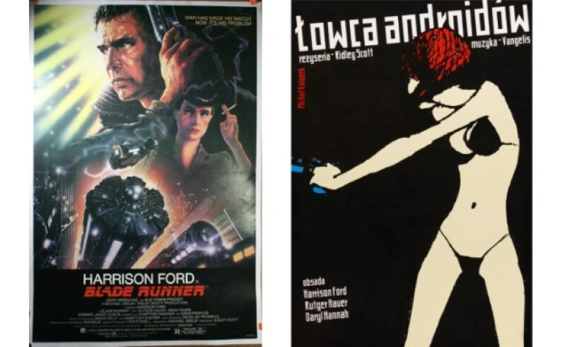
Poland again! We can’t help mentioning such a free-spirited interpretation of the film, grabbing your attention. There are no images of the main characters, no post-apocalyptic scenes in the background, and not even the face of a girl holding a gun. Instead, the viewer's attention is drawn to simplicity and minimalism. Here, the unique, original culture of the Polish poster, which permeates many areas of local society, does not allow you to fully understand the outline of the story that will be told in the film. So additional knowledge is necessary - your mind needs it to relate the information about the story from such a minimalistic picture.
Frozen 2
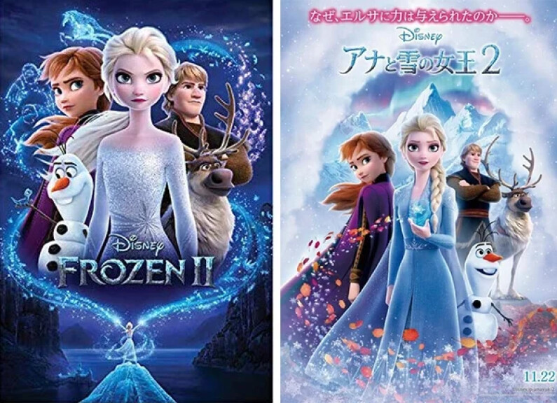
On the left is, of course, an American poster. On the right, surprisingly, you will see a Chinese one. So, what has changed? First, the main character's facial expression - they are now half smiling. The change is simple: Based on reports from marketing agencies based in China or through analyzing the Chinese market, advertising campaigns displaying negative emotions perform extremely badly. So, the Chinese poster's designers replaced even the curiosity on the "face" of the snowman with joyful expressions just in case.
How has your favorite movie poster been adapted in other countries? Explore the different versions: we are certain you will find many interesting cultural features reflected in the images.
Share this with your friends!


Be the first to comment
Please log in to comment